Anatomy of a High Converting Website
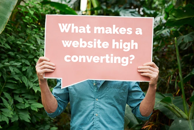
What makes a website high converting? Obviously, the more vistors you can convert to leads the better but how exactly do you do that? We gathered a few tips here for those trying to get better conversion rates out of their website.
Fast Loading Speed

The first part of getting a website to convert better is to first make sure vistors get on your page. According to Google 53% of users will leave if a site takes longer than 3 seconds to load. So, if your site is slow, you are losing half of your potential clients right off the bat. Use Google Pagespeed Insights to be sure your site is loading up quickly. This also has an affect on how high you rank in Google search so it is doubly important.
Respopnsive Design

Fast loading speed flows naturally into responsive design. According to SEMRush mobile visitors made 233% more unique visits than those on Desktop. With 3.3x more unique visitors from mobile than from desktop a high coonverting websites needs to focus on mobile first.
Clear Calls To Action

Guiding users to the next step is important. Clearly letting them know how to get there is also important which is where the Call To Action comes into play. For wedding vendors in particular you want to have Calls To Action that clearly articulate the next phase in the sales process. Maybe it is "Book a Free Consultation" or "Get Started" or "Sign Up".
Whatever you choose just keep it short and sweet and consistent across your site ao users can easily see what to do next.
Visual Design
I think this one is a little bit under represented. A lot of people won't worry too much about the design because they think if they have something nice and simple up there it will be good enough.
The truth is having a consistent strong brand will assist greatly in converting vistors to leads. Wheter consciously or subconsciouly people can tell a good design when they see one and having that strong design is a real benefit to your website and its conversion ratio.
User Friendly with Clear Navigation

This is an extension of of visual design from above but I see so many websites that try to be cute and clever with their navigation and while those sites might look cool this is a symptom of designers doing things differently just to do them differently.
When making something new it is very important to stick to tried and true design principles especially as it relates to navigation and ease of use. You don't want to sacrafice the usability of the site for a cool looking design and this can really hurt conversion rates. Making a high converting site is as much about removing barriers to conversion as it is inspiring action.
Social Proof

If you can, including social proof is a wondering way to increase conversion rates. 84% of people trust online reviews as much as they trust recommendations from friends. Including social proofs like reviews will show those visitors who might be on the fence that you have done this before and will be a good partner for their event.
Hopefully, these tips can give you some ideas on how you might be able to make some modifications to your own site to bring in more clients.